
NEWS
Google Photos Tests a Brush Slider and Grid Off Switch
Version 7.92 hides a pen slider, 25-plus colors, 14 fonts, and a Feature photos kill switch, the same week Photos’ boss called the grid polarizing.

Google Photos is testing a brush-size slider, more than 25 markup colors, 14 new fonts, and a switch that stops the home grid from enlarging “notable” shots.
On September 10, testers enabled those flags in 7.92.0.977185651 as Photos vice president Shimrit Ben-Yair called the grid polarizing and said a wider overhaul is already underway.
A Brush Size Slider Hides in Version 7.92
The work sits in Google Photos 7.92.0.977185651, a package listed on September 9. Testers flipped developer flags and got a first look at tools that have barely moved in years. It is not on by default, and Google has not set a public ship date.
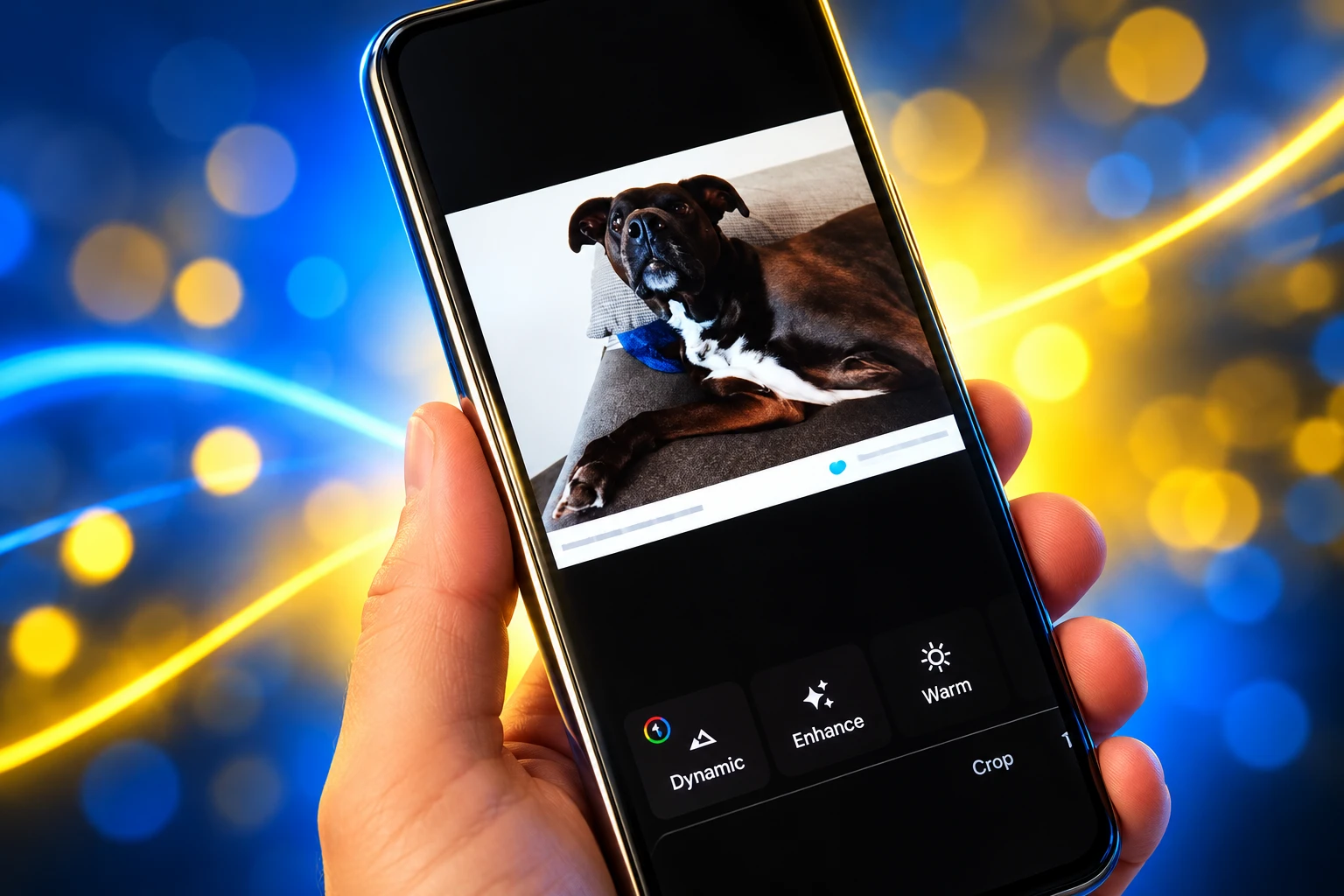
Right now the Pen and Highlighter tools offer seven colors and a fixed stroke. You cannot thin a line to underline a price on a receipt or fatten a highlighter to cover a license plate in one pass. The Text tool uses that same seven-color set, with no extra typefaces and no left, center, or right alignment.
The test UI puts a dedicated size slider on Pen and Highlighter so a stroke can go from a hairline to a wide mark. Both tools pick up over 25 shades. Text gains those extra colors, left-center-right alignment, and 14 new font styles. Testers turned on names that run from “Classic” and “Elegant” to “Gothic” and “Type.”
MARKUP IN THE LIVE APP VERSUS THE 7.92 TEST
| Tool | Live Google Photos | Flags on in 7.92.0 |
|---|---|---|
| Pen | Seven colors, fixed stroke | Over 25 colors, size slider |
| Highlighter | Seven colors, fixed stroke | Over 25 colors, size slider |
| Text | Seven colors, one look, no alignment | Extra colors, 14 new fonts, left/center/right |
That is catch-up, not a new class of editor. Apple’s system Markup has let people tap a pen twice and pick thickness and opacity for years, with a ruler, shapes, and a signature tray on top. Photos is still a pen, a highlighter, and a text box. The slider only makes those three tools less blunt.
Seven Colors Is Still the Live Palette
The gap is sharper because Google already ships a better pen elsewhere. In Google Docs on Android, markup mode lets you change the Pen or Highlighter size and color from the same toolbar. Photos, the app that actually holds the screenshots, did not get that control.
People dump those screenshots into Photos because that is where the camera roll already lives. A parent circles a date on a school flyer. A renter arrows a stain for a landlord. A shop marks a SKU on a shelf photo. Those jobs leave the app when the stroke is wrong, which is how a cloud library loses the five seconds after you tap Edit.
Google’s own 10th-birthday note, posted May 28, 2025 by Ben-Yair, still sets the scale. More than 1.5 billion people use the product each month, with over 9 trillion photos and videos stored. Every month, more than 370 million people search their libraries, 440 million share memories, and 210 million edit their photos.
PHOTOS AT THE 10-YEAR MARK
- Monthly users: More than 1.5 billion people open Google Photos.
- Library size: Over 9 trillion photos and videos sit on the service.
- Monthly editors: 210 million people edit a photo in a given month.
- Free tier: Accounts still share 15 GB across Photos, Drive, and Gmail.
Most of those 210 million people are not drawing Gothic captions. They crop, they tap Auto, they try a Magic Editor pass. Markup is the small analog slice, and Google starved it while the rest of the editor filled up with suggestions. In 2025 the video editor in Photos already picked up extra fonts and alignment in test builds. The still-image Text tool is only now getting the same kind of tray.
Redact Already Sits Beside the Pen
The 7.92 slider is not a one-off leak. Through the summer Google rebuilt the Markup row around a fourth tool that the live app still lacks: Redact.
Code in version 7.85.0, opened in testing on July 23, 2026, added a Redact control next to Pen, Highlighter, and Text, with a string about redacting sensitive areas. Tapping it crashed the app. By version 7.89, testers had it working on August 19. The panel uses a size slider and three cover styles.
THE MARKUP TRAY SINCE JULY
- July 23, 2026: A Redact control appears in Markup in 7.85.0 and crashes when tapped.
- August 19, 2026: Version 7.89 runs Redact with Mosaic, Mosaic Light, and a noise-based Blur, plus undo, redo, and reset.
- September 9, 2026: Package 7.92.0.977185651 is listed for Android 10 and up.
- September 10, 2026: Testers enable the Pen slider, over 25 colors, 14 new fonts, and the Feature photos switch.
Mosaic cuts the brushed area into small blocks. Mosaic Light uses coarser blocks. Blur is not a camera smear; it lays grain over the pixels, closer to static. The Redact slider is the same idea as the new Pen slider: stop guessing a stroke width. That tool is still a test feature of its own, separate from the 7.92 font and color flags, and it has no public rollout either.
Until Redact ships, the workaround remains the Pen. People scribble over account numbers and faces, which is a poor stand-in for a mosaic. Google is late here too. Samsung, OPPO, and OnePlus gallery apps already pixelate. Photos is the library those screenshots sync into, so the missing tool shows up every time someone shares a boarding pass from the cloud copy.
An Off Switch for Enlarged Thumbnails
The other flag in 7.92.0 is not a brush. It is a setting labeled Feature photos, found under Photos view. The description testers saw says it can “automatically enlarge photos in your grid to highlight notable moments.” Turning it off keeps every thumbnail the same size.
Google Photos already offers Comfortable, Day, and Month layouts from the three-dot menu on the home page. Comfortable stays even. Day and Month let the app blow up selected tiles, which breaks the scan line when you are hunting a burst or deleting near-duplicates. The new switch targets that behavior. In the test build it does not change Comfortable, and it is unclear whether that limit is temporary.
WHAT THE FEATURE PHOTOS SWITCH CHANGES
- Day layout: Enlarged “notable” tiles can drop back to the same size as their neighbors.
- Month layout: The same uniform grid applies when the switch is off.
- Comfortable layout: The test flag leaves this view alone.
- iOS app: Google Photos on iPhone already has a Feature photos checkbox in its grid menu.
Android is arriving last to a control its own iOS client already shows. The complaint is older than this build. On August 11, 2022, a Google Photos Community thread asked why the app would enlarge some photos breaking the grid whenever the row held fewer than five columns, which made it hard to keep a sequence in order. The poster noted that folder view already kept even tiles, so the code for a flat grid existed. The home feed still starred shots on its own.
A uniform grid is how you compare five frames of the same cake. A starred grid is how an algorithm performs a slideshow on your camera roll. The Feature photos toggle is Google admitting those are different jobs.
On September 10 the Grid Fight Went Public
The markup flags and the Feature photos switch landed in testing on September 10. That afternoon, APKMirror founder Artem Russakovskii wrote that Google Photos had stopped showing dates on the home grid and that a new toggle for those dates defaulted to off. People who wanted day breaks had to find a setting Google had left dark.
Ben-Yair replied to him the same day. She leads Google Photos, Google One, and AI subscriptions, and she did not pretend the grid was settled.
Dates in grid filters is a polarizing topic, with strong perspectives on both ends. The good news is that we are in the process of overhauling our grid with many more improvements to come!
Shimrit Ben-Yair, Vice President, Google Photos, on X
Thanks for the feedback, Artem! Dates in grid filters is a polarizing topic, with strong perspectives on both ends 🤓. The good news is that we are in the process of overhauling our grid with many more improvements to come! And I shared your POV with the team too. CC @yaelmarzan
— shimrit ben-yair (@shimritby) September 10, 2026
That is the tell. The 14 fonts will get the screenshots. The product decision is the grid. Google spent the last two years teaching Photos to talk, star, and suggest. In 2024 it opened early access to Ask Photos, a Gemini-powered conversational search, while the Pen still had seven colors and no size control. Dates later vanished from the default grid, then returned as a switch left off. Feature photos now gets its own off switch in a test build, and only on Android, and only in Day and Month.
Each of those moves is a small apology to people who want the library to sit still. Ben-Yair’s “overhauling our grid” line says more of those apologies are queued. The analog markup tray is the same pattern in the editor: give the user a slider after the app tried to guess.
What the Test Build Still Omits
Even with flags on, Photos markup is still a thin tray. There is no arrow, no rectangle, no signature, no ruler, and no opacity control on the Pen. You cannot stamp a numbered callout on a leaky pipe. You cannot drop a filled box over a password, which is why Redact is in another test branch. The 14 new fonts dress up a caption. They do not replace a shape kit.
The iOS gap is wider. A Google Photos Community product expert told an iPhone 15 Pro owner on June 9, 2024, that Markup is not in the iOS Google Photos app at all, and pointed the user at Snapseed. That reply is two years old and could be stale, but Google has not advertised an iOS Markup tray in the 7.92 work, which is an Android package. iPhone users who live in Google Photos still leave the app to draw, even if they already have a Feature photos checkbox.
STILL MISSING AFTER THE 7.92 FLAGS
- Shapes: No arrows, boxes, or circles in the Photos markup tray.
- Opacity: No transparency control on Pen or Highlighter in the test UI testers showed.
- Redact: Mosaic, Mosaic Light, and Blur remain a separate 7.89 experiment, not a live control.
- iOS Markup: The 7.92 work is an Android APK; Google has not shown the new pen slider on iPhone.
Third-party markup apps sell those gaps. They add face mosaics, multi-page PDFs, and calibrated rulers because the default gallery still treats drawing as a doodle. If 7.92’s slider and fonts ship, fewer people will bounce out for a red arrow. They will still bounce out for anything the tray cannot name.
Flags Stay Off Until Google Ships Them
Everything here is unfinished code. Testers had to enable flags. Google has not posted a changelog, a Help Center article, or a date. APK teardowns routinely describe tools that stall, change, or die. Redact sat broken in 7.85 and only became a demo in 7.89. The Feature photos switch might ship on, off, or not at all. Ben-Yair’s grid overhaul could swallow it, replace it, or sit beside it.
WHAT WE KNOW
- The package: 7.92.0.977185651 carries hidden Markup and Photos view flags testers could turn on.
- The live limits: Pen, Highlighter, and Text still use seven colors, with no brush-size control in the shipping app.
- The grid line: On September 10, Ben-Yair said Photos is overhauling the grid after calling date filters polarizing.
WHAT IS UNCONFIRMED
- Ship date: Google has not said when, or whether, the slider, fonts, or Feature photos switch will reach Play Store users.
- Defaults: Testers flagged that Feature photos might arrive turned on; that is still a guess.
- Comfortable view: The test switch did not touch that layout, and Google has not said if it ever will.
Until a stable build flips those flags for everyone, the live editor is the one with seven colors and a stroke you cannot thin. The live Android grid is the one that still stars tiles unless you are on Comfortable. The interesting part of 7.92 is not that Google discovered fonts. It is that the same week the company hid a size slider and an off switch in a test package, the person who runs Photos said the grid itself is up for a rebuild.

Edinburgh Opens a 2027 Tour Built for Time Trials

Korda Maps Auður From Meðalland to Irvine Bay

Apple Music Films Its New Logo in Mineral Oil

Oppo Prices the Pad Mini Above India’s iPad Mini

Austen Soaks Scotland Before Boelo Brings Weekend Gales

Volkswagen Sells the Osnabruck Plant to Clear a Board Fight

Apple’s Foldable iPhone Hinges on Samsung Display Supply

Tata Motors’ Iveco Tender Opens as Holders Still Decide

Saksham Gaur Finds He Is His Own Company’s Client

Onimusha Way of the Sword Preload Hits a Windows 11 Wall
-
 AUTO2 months ago
Volkswagen Sells the Osnabruck Plant to Clear a Board Fight
-
 NEWS2 months ago
Apple’s Foldable iPhone Hinges on Samsung Display Supply
-
 AUTO2 months ago
Tata Motors’ Iveco Tender Opens as Holders Still Decide
-
 BUSINESS2 months ago
Saksham Gaur Finds He Is His Own Company’s Client
-
 GAMING2 months ago
Onimusha Way of the Sword Preload Hits a Windows 11 Wall
-

 ENTERTAINMENT3 years ago
What is SD on Amazon Prime? – All You Need to Know
-

 BUSINESS2 months ago
Hyderabad 22-Carat Gold Jumps After a False Bargain
-
 NEWS2 months ago
The Frame Pro’s $1,200 Labor Day Cut Needs a Soundbar