
NEWS
Apple Music Films Its New Logo in Mineral Oil
Apple Music filmed Fred again.. notes in mineral oil for its first rebrand since 2015, then put a quieter black-and-white note on the Home Screen.

Apple Music unveiled a new look on October 21, filming notes by Fred again.. through mineral oil so the logo would bend on camera. The 78-second film is titled Made by Sound. Months of analog tests produced that film and the video bumpers that will open original clips, while the Home Screen icon goes black and white.
TBWA\Media Arts Lab, Apple’s long-time agency, reversed the usual order. Sound came first. The picture was what the liquid did when those notes hit it.
Sound Had to Be Quiet Enough to See
The team wanted a picture that was music, not a drawing of music. In the film, the narration puts the brief in one line.
For the rebrand of Apple Music, we wanted sound to create the visuals. How do we take this idea of music and distill it into something visually beautiful?
TBWA\Media Arts Lab, Made by Sound
A transducer turned the audio into physical vibration. That rig moved a shallow bath of liquid at the frequency of each note. The agency called the target the perfect sound wave. Fred again.. and his collaborator NEST Acoustics then broke a short piece into those notes and built a mnemonic the brand will play as its sonic signature.
The oil did not take every melody. Notes piled too close, or pitched too high, threw the surface so hard the mark vanished. The musicians had to rewrite the tune around what the tank would hold, which took months of tests. The sound and the picture were mixed as one job, not a track laid under a finished logo.
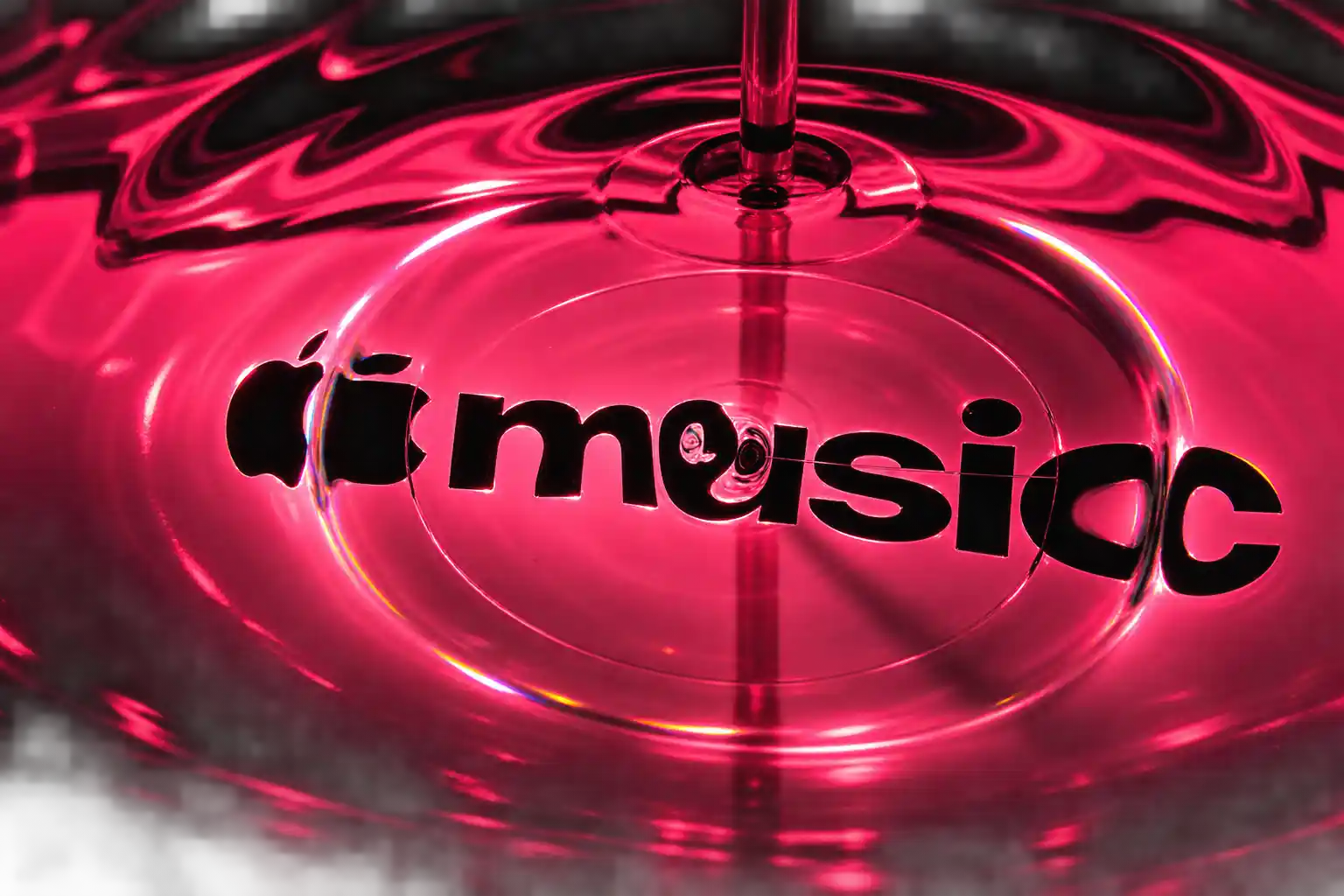
The Letters Went Into a Tank of Oil
For the shoot, acrylic versions of the Apple Music note and the new wordmark sat in the bath. Mineral oil was the liquid, picked for thickness. The ripples read like glass being pushed, which also sits next to Apple’s Liquid Glass interface look. Cameras pointed at the surface as the finished piece ran through the rig. Colour washed across the warped edges. Apple says that motion was captured in camera, with no computer animation of the waves.
WHAT THE TANK WOULD NOT ALLOW
- High notes: Tones pitched too high threw the oil so hard the logo was hard to read, so the tune had to change.
- Crowded phrases: Too many notes at once had the same problem, which set a ceiling on how busy the mnemonic could be.
- Thin liquid: Water was not thick enough; mineral oil gave the slow, glass-like ridges the cameras needed.
- A digital shortcut: The ripples were filmed as they happened, then that footage became the motion identity.
The companion film still lists finishing houses. Optical Arts produced it, Joe Jackson directed, Time Based Arts is credited for VFX, Trafik handled colour, and Model Citizen mixed the music. That is the package around a shoot Apple describes as in-camera. The static mark had a second life after the tank. Plau is credited for type consultation and for reconstructing the logo as a vector, which is the clean drawing that can live on a tiny icon.
Apple Music posted the behind-the-scenes film the same day as the launch sting.
Go behind the scenes of Made by Sound.
A story of music, collaboration and craft with @fredagainagain1 and NEST Acoustics. Discover how sound brought the Apple Music logo to life, captured entirely in camera. Just music, made visible. pic.twitter.com/ZyMRGdUVUX— Apple Music (@AppleMusic) October 21, 2026
iOS 27.2 Trades Red for Black and White
Users will not tap a tank of oil. They will tap a note. In light mode the new app icon is a black Music symbol on white. In dark mode it flips to white on black. The red-and-pink tile that marked the service for years is gone, and the icon now has to be read by shape alone.
Developer builds of iOS 27.2 already carry that tile. The fourth beta, dated October 13, also swapped the old red-pink tab highlights for blue and turned Music widgets to black. Apple is rolling the same system across original videos, concert films, marketing, and the app as that software update ships. The four-second identity sting on the brand’s own account is the motion version. The Home Screen gets the still.
THE APPLE MUSIC IDENTITY SHIFT
| Piece | What went away | What ships |
|---|---|---|
| App icon | Red and pink note tile | Black on white, or white on black |
| Wordmark | Uppercase Music in standard SF | Lowercase Music in a heavier custom SF Pro |
| Tab bar | Red-pink selected state | Blue selected state |
| Widgets | Red and pink backgrounds | Black backgrounds |
| Sonic logo | No shared new mnemonic | Notes by Fred again.. and NEST Acoustics |
| Motion mark | Standard animated end boards | In-camera oil ripples on original video |
The wordmark keeps the Apple symbol and sets “music” in bold lowercase, using a custom cut of SF Pro, the system font for Apple platforms. The agency’s line is that the heavier, tighter letters give Music a voice of its own without leaving the Apple family. SF Pro already ships in nine weights with variable optical sizes. This job asked it to look less like a settings label and more like a record sleeve.
Who Wrote the Notes the Oil Could Hold?
Fred again.. is the name on the poster, the British producer billed as a partner on the mnemonic. NEST Acoustics is billed as his collaborator, and that is the quieter half of the craft story. NEST is a sound designer who sells multi-sampled Morphology instruments built from odd sources, among them attic air ducts, bird calls, and fireworks, then morphed into playable hybrid patches. The same person ships a drum tool called SKIN that is meant to make samples feel less machine-regular. Apple did not hire a faceless audio house. It hired someone whose published work is about making recorded air sound handmade.
TBWA\Media Arts Lab, which works only for Apple, framed the whole system as proof of a line the company already uses. “When we say that everything we do is about music and artists we mean it,” the agency said. “Now even our logo represents that core value.” The new audio language is supposed to follow the same notes into the product, so the brand looks and sounds as one object.
Apple analyst Neil Cybart boiled the film down to three words: “Apple betting on humans.” That is the bet the tank is there to advertise. The vector rebuild by Plau is the part of the job that still had to become a scalable mark, because a ripple in oil cannot sit at 60 pixels without being drawn again.
London Saw the Wordmark First
The new letters did not wait for the film. They showed up in September on marketing for Apple Music Hall, a 600-capacity venue at Battersea Power Station that Apple announced on September 21. The room sits under Apple’s European offices, with a 38-foot stage, a 48-speaker spatial system, two mix studios, and hardwiring for 16 or more cameras. An artist can play an intimate set and leave with a Spatial Audio recording, a broadcast mix, and multicamera video from the same night. Shows are meant to be livestreamed, which is why the service now needs bumpers that feel like music rather than a generic end slate.
Oliver Schusser, vice president of Apple Music and International Content, tied the Hall to a line that runs from the iPod through the old iTunes Music Festival. Zane Lowe, global creative director and lead anchor for Apple Music 1, called the room a place to put artists and fans in the same air and then share it. London radio studios moved into Battersea at the same time. The catalog behind all of that is more than 100 million songs, on sale in over 167 countries and regions, with Radio still free and running all day.
HOW THE NEW MARK ARRIVED
- 2015: Apple Music launches after Beats Music, and that identity holds for 11 years.
- September 21, 2026: Apple announces Apple Music Hall in London, and the new wordmark appears on the venue’s marketing.
- October 13, 2026: iOS 27.2 beta 4 replaces the red app icon with the black-and-white note and recodes tabs and widgets.
- October 21, 2026: Apple Music posts Made by Sound and the four-second identity sting, and names Fred again.. and NEST Acoustics.
This is the first full rebrand since launch. The Hall is the physical reason the type had somewhere to go before the film dropped. Original content and further event programming are listed as the next surfaces for the same letters.
APPLE MUSIC HALL IN FIGURES
- Room size: 600 people, built for a small crowd with arena-level kit.
- Stage: 38 feet wide, able to face forward or sit in the round.
- Sound: 48 speakers placed around the audience for spatial sets.
- Cameras: 16 or more feeds into a broadcast control room, with iPhone capture running beside traditional kits.
Those cameras are why a liquid opener is not a one-off ad. The venue is a factory for concert films. The new mark is the slate those films will wear.
A Browser Ran the Ripples the Next Day
Under Apple’s own launch post, the reply that travelled furthest did not praise the type. It posted a still from the oil tank and asked Apple to use that image as the app icon. Other replies called the new mark ugly. A separate strand said the liquid-glass motion looked fine and the loss of red did not. The red note was how you found Music in a grid of apps. Black and white makes it look like a system tool, which is a real cost on a phone that already has a lot of monochrome tiles.
The other leak in the handmade story showed up within a day. A developer matched the oil look frame by frame in WebGL and ran it live in a browser, with a control that accepted any logo. The tank is still a real shoot. The picture it made is not a lock that code cannot pick. What does not copy is the months of rewriting notes until the liquid stayed readable, and the decision to let that constraint write the mnemonic.
Designers who liked the work pointed at the same gap from the other side. Interfaces spent years going flat. This job tries to put weight, refraction, and a material back into a streaming brand. The intent is tactile. The object most people will see all day is still a flat glyph.
Original Videos Open on the Liquid Mark
Apple says the new visuals will lead Apple Music videos, including concert footage and other original shows, then move through marketing and the app. That is the surface where the tank footage can stay large. A bumper can hold colour, warp, and the mnemonic. A Home Screen icon cannot. The same notes that shook the oil are now the sonic logo, and they will play over films the Battersea room is wired to shoot with 16 or more cameras.

Edinburgh Opens a 2027 Tour Built for Time Trials

Korda Maps Auður From Meðalland to Irvine Bay

Apple Music Films Its New Logo in Mineral Oil

Oppo Prices the Pad Mini Above India’s iPad Mini

Austen Soaks Scotland Before Boelo Brings Weekend Gales

Volkswagen Sells the Osnabruck Plant to Clear a Board Fight

Apple’s Foldable iPhone Hinges on Samsung Display Supply

Tata Motors’ Iveco Tender Opens as Holders Still Decide

Saksham Gaur Finds He Is His Own Company’s Client

Onimusha Way of the Sword Preload Hits a Windows 11 Wall
-
 AUTO2 months ago
Volkswagen Sells the Osnabruck Plant to Clear a Board Fight
-
 NEWS2 months ago
Apple’s Foldable iPhone Hinges on Samsung Display Supply
-
 AUTO2 months ago
Tata Motors’ Iveco Tender Opens as Holders Still Decide
-
 BUSINESS2 months ago
Saksham Gaur Finds He Is His Own Company’s Client
-
 GAMING2 months ago
Onimusha Way of the Sword Preload Hits a Windows 11 Wall
-

 BUSINESS2 months ago
Hyderabad 22-Carat Gold Jumps After a False Bargain
-

 ENTERTAINMENT3 years ago
What is SD on Amazon Prime? – All You Need to Know
-
 NEWS2 months ago
iQOO 16 Locks 8,400 mAh While 100W Charging Holds